Strikeout ALS
March 2026
Illustration, Packaging
Illustration, Packaging
Flexing my illustration skills towards a great beer supporting an even greater cause.
Meet Wormtown
Named after its home plate in Worcester, Wormtown is a craft brewery with deep pride in its New England roots. The brewery partnered with the Pete Frates ALS Foundation, raising funds for those affected by ALS.
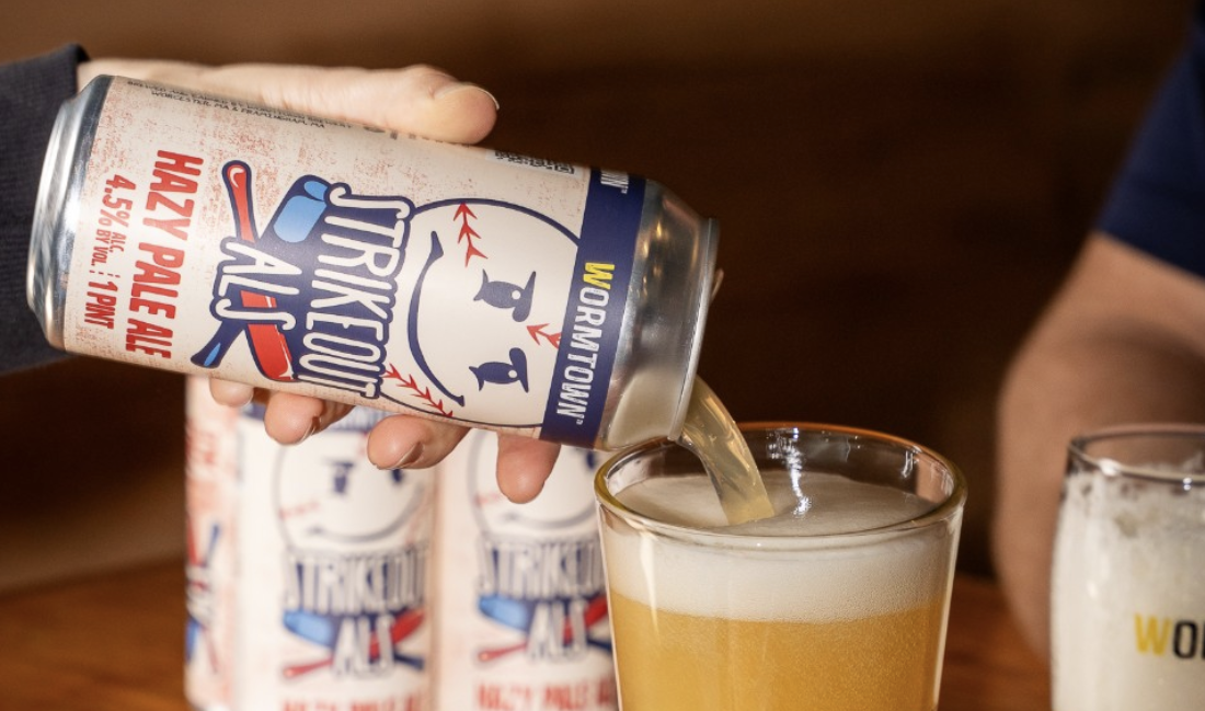
Strikeout ALS is a hazy IPA representing the New England sports community, including Pete Frates’ legacy as a baseball player for Boston College.
Strikeout ALS is a hazy IPA representing the New England sports community, including Pete Frates’ legacy as a baseball player for Boston College.
My Job
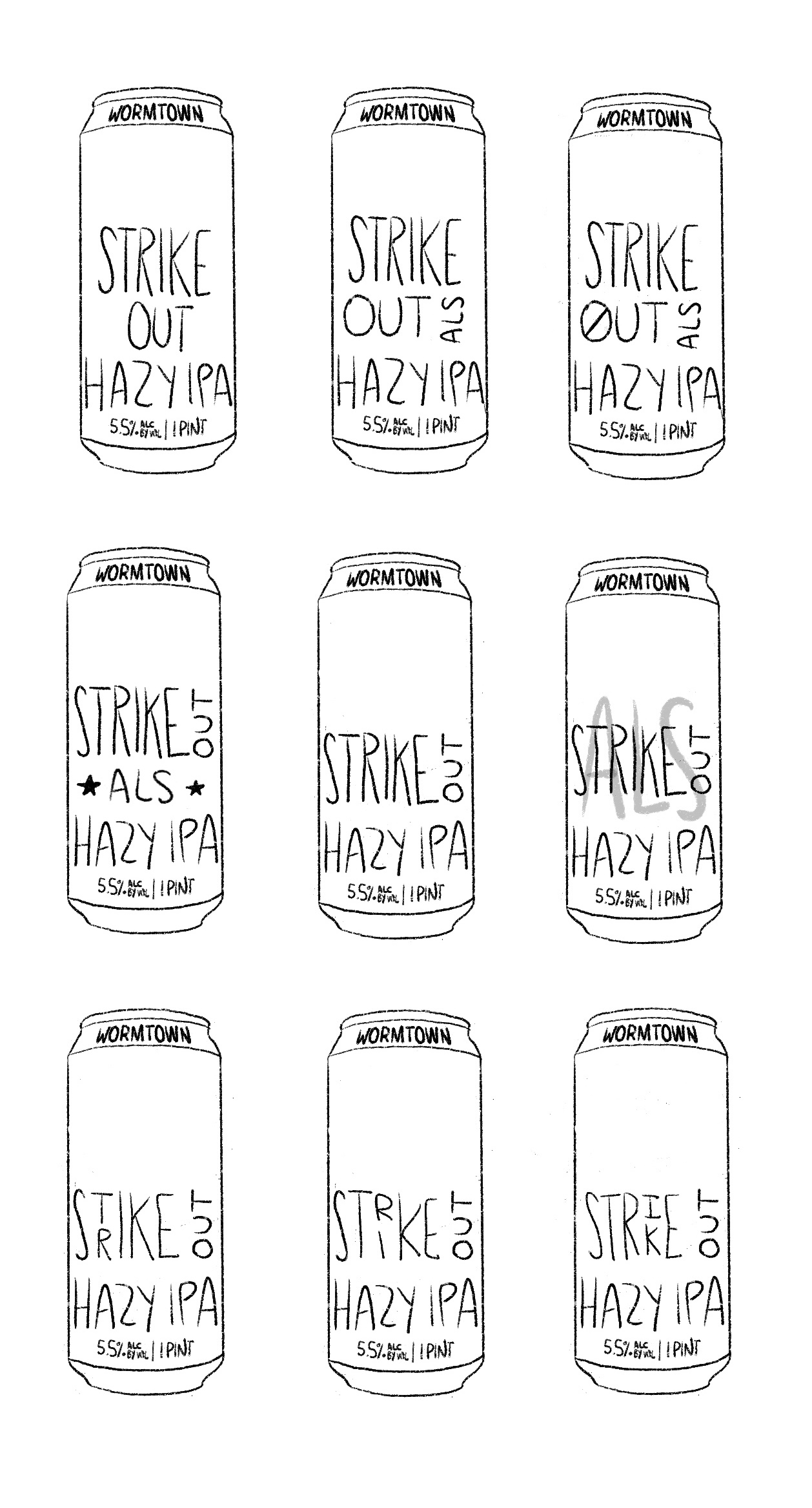
As a designer with Wormtown’s overarching brewing company, I led the can design’s production from concept to print-ready files. I took great focus in the design’s layout and typographic details.
Concepts and Iterations
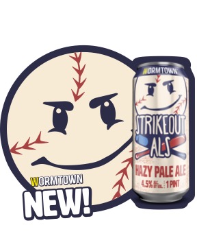
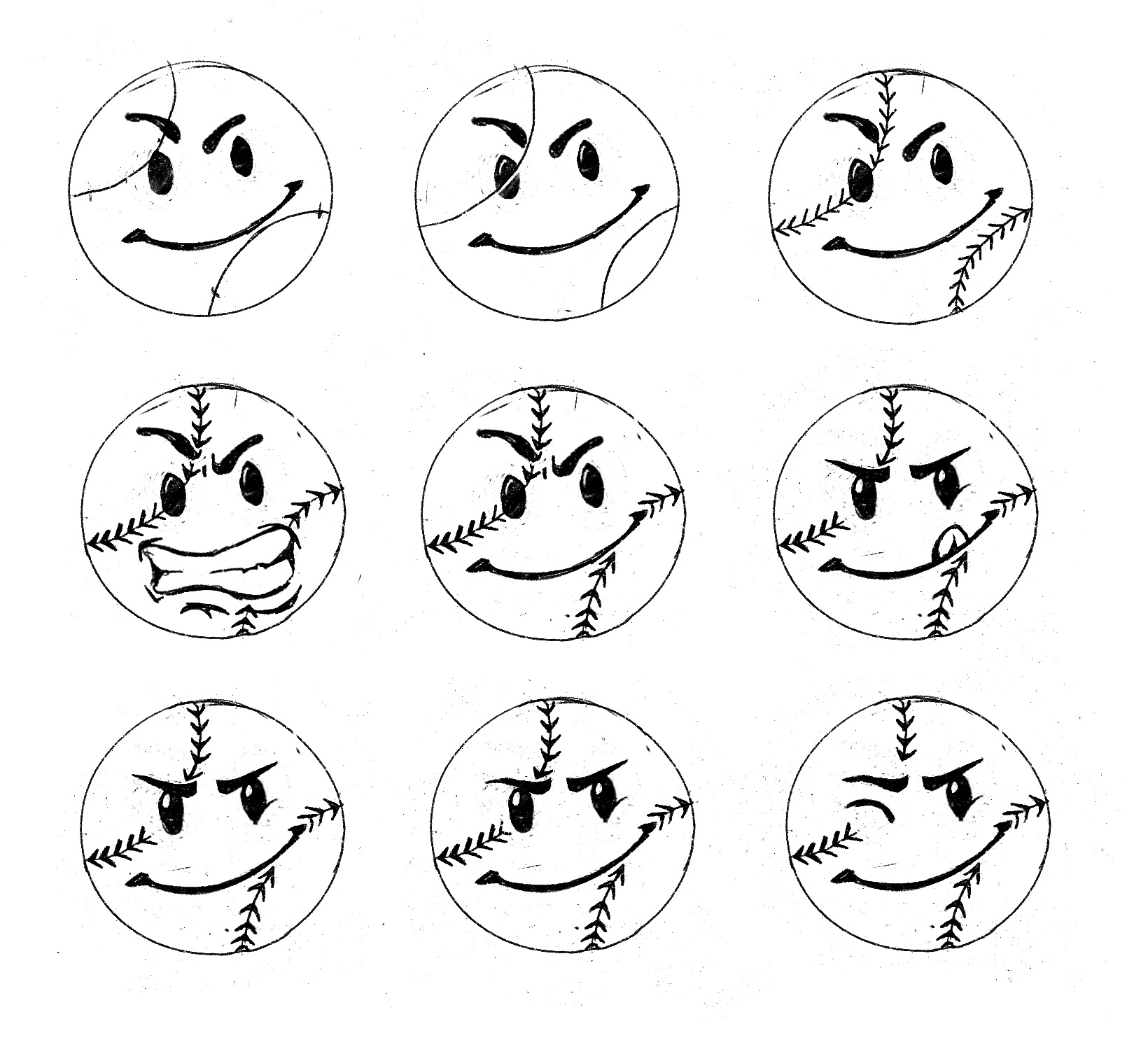
The craft brewery holds a pattern in its can designs with a representative face on the front, inspired by the Worcester-made smiley face.
I incorporated this theme with a baseball as the face of the can, with a focused and sharp expression just as a pitcher would have.
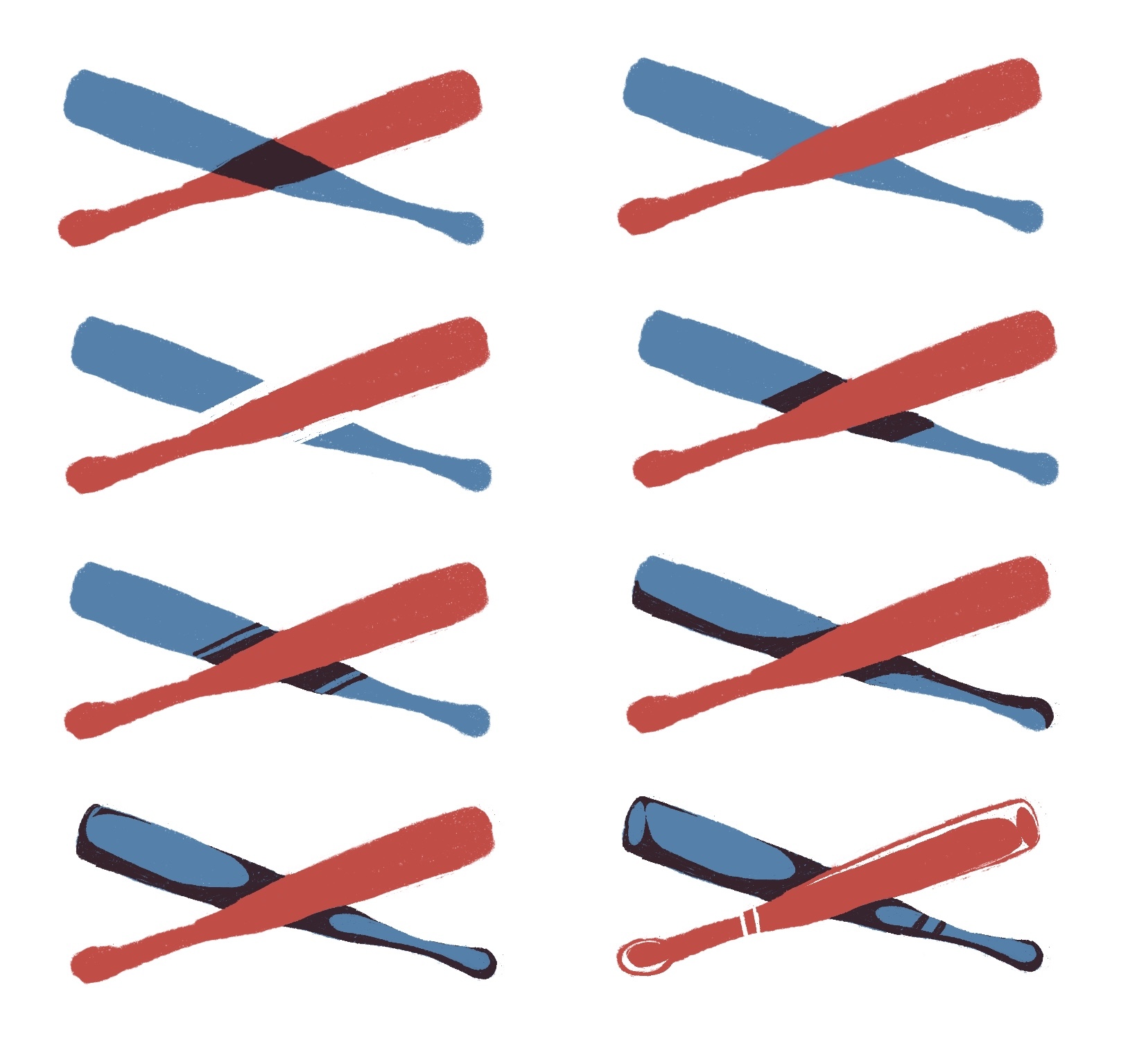
My creative team and I were inspired by the Americana visual style, with baseball as a cultural symbol of New England’s Fenway heritage.
Combining legacy with ALS advocacy, my illustrations complement the beer’s title with a lockup of baseball bats. The label’s textured background adds grit and complements the cleaner foreground.
I incorporated this theme with a baseball as the face of the can, with a focused and sharp expression just as a pitcher would have.
My creative team and I were inspired by the Americana visual style, with baseball as a cultural symbol of New England’s Fenway heritage.
Combining legacy with ALS advocacy, my illustrations complement the beer’s title with a lockup of baseball bats. The label’s textured background adds grit and complements the cleaner foreground.

Original design from Procreate

Final iteration
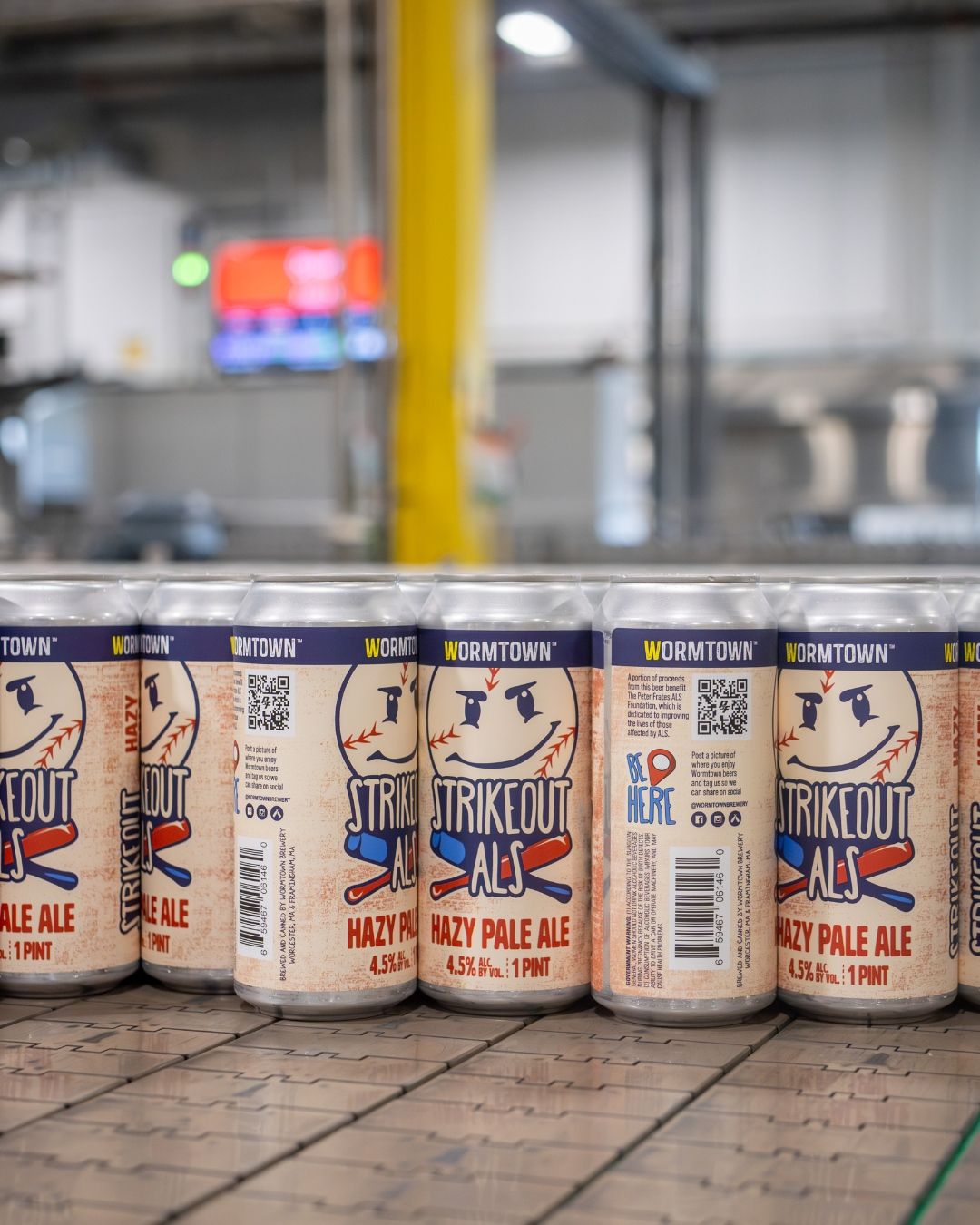
Packaging Considerations
For a liquor store with dozens of cans trying to grab your attention, I knew the importance of making Strikeout ALS recognizable. In this case, I prioritized readability from far distances by leveraging Wormtown’s existing branding with a large face on the front.
With this in mind, the illustrations in the design are striking, quite literally. The navy outlines stand out against the lighter background, and its cream hue tones down the brighter colors to balance the composition.
With this in mind, the illustrations in the design are striking, quite literally. The navy outlines stand out against the lighter background, and its cream hue tones down the brighter colors to balance the composition.
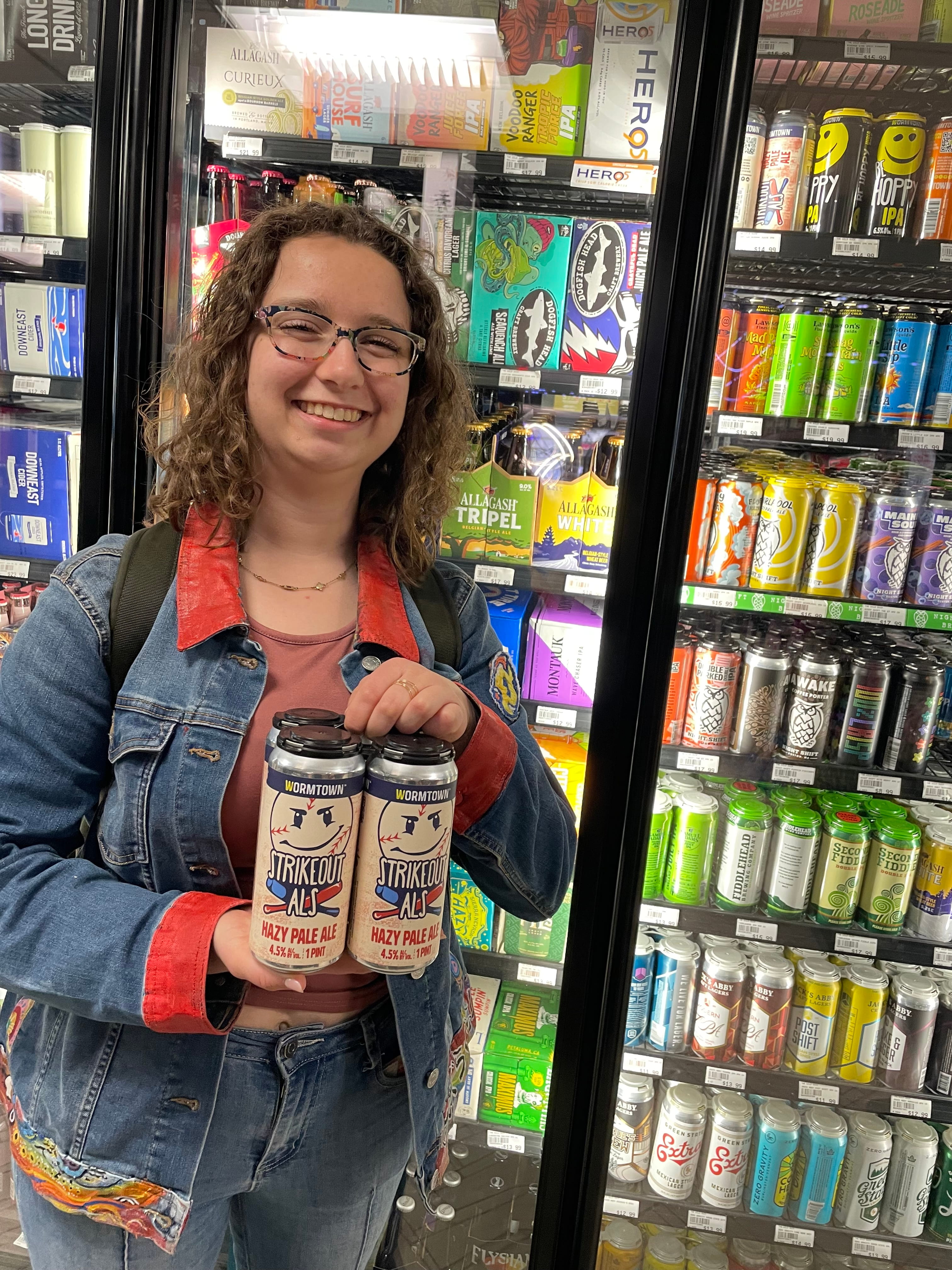
The Final Pitch
Balancing brand consistency with a distinct visual identity, Strikeout ALS made its way into liquor stores local to New England.
I’m thrilled to see my design come to life as my contribution to the ever-increasing amount of New England IPAs.
I’m thrilled to see my design come to life as my contribution to the ever-increasing amount of New England IPAs.